JULIE ZHU
I'm Julie 👋
A restless UX Designer
where visual art meets technology and user experience. My goal is to craft designs that are both efficient and engaging, blending simplicity with creativity.
Currently UX Designer @ Verizon
Previously @ Parsons

Fond
Branding

OVERVIEW
VISUAL BRANDING FOR JAPANESE RESTAURANT
I created the concept, then designed the visual identity for the restaurant FOND.
The restaurant is located in a hotel, which allows customers to catch fish in the pond by themselves. After that, the restaurant helps customers to cook the fish in their own preferred style. During the time, the hotel holds some workshops to help customers better engage in the "making & dining" process.
-
Fishing + Pond = FOND (v.)
Timeline
Sep-Oct 2018
Design
Role: Visual Designer

LOGO

According to my drafts and inspirations, I finally inspired by the elements of fish, wave, fingerprint, seal wax and Yinyang together. Fish and wave symbolize the “Fishing” activity and the “pond”, Yinyang has the meaning of balance that gives blessing to the long-term prosperity of this restaurant and the hotel. In addition, fingerprints can provide a safe feeling which is important to customers. All these elements give a sense of a seal. The broken line and the color red also imply the characteristic of a sealing wax.
POSTERS
I have indicated the interesting scene of the services and activities in the posters. Each poster centers around one of the letters in the brand name, so hanging this series of posters brings unexpected effect. Also, I used the letter as a container to present some small pictures inside of its strokes.
Some visual elements are sourced online.


WEBSITE
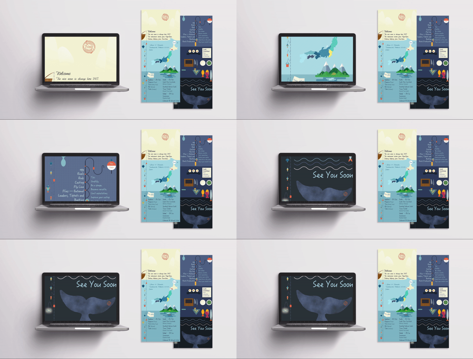
I designed the website in a straightforward style. There is always a small key element across the page (such as wave or a drop of water) as a connecting tissue of two pages. On the left, the long fishing line is the mark of your location at the website. By clicking the basket, customers can go to the matching page quickly.

